Album Cover:


The key features of the album cover is the grey-scale colour pallet, and the use of pictures that show the artist's past in black and white. The title font is white and in a bold, yet italic style, whereas the majority of the text on the back is black and bold. The photos also use an urban theme, for example with the picture of the terraced housing.
Promotional Content:
As part of promoting his album, Kano released a short documentary detailing his childhood called 'Made in the Manor' - repetition of his album title.
The audience recognises the setting as generally consisting of terraced housing, which again, thematically, gives it an urban feel. We also see old images and photos, such as pictures of Kano's mam.
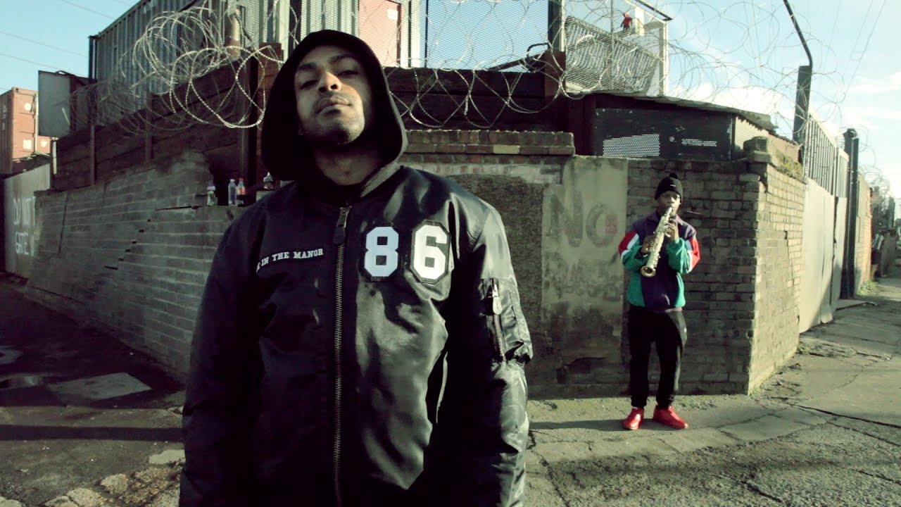
Music Video:
This music video uses a grey-scale colour pallet, achieved through a filter which was added during editing. Another key feature is the terraced housing, which reinforces the urban theme of the video. In terms of costume, the tracksuits and big jackets are a common feature of the video.
Music Video:
An obvious key feature of this music video is the costumes throughout - there is an emphasis on white summer clothing. However, we also see the terraced housing as part of the urban theme.We also see some footage that has an effect to make it seem 'old' like it has been recorded on a 90's video camera. The setting of the park in good weather also acts as a dominant feature of the video.
Synergy:
Across all of the products, we see a few key features that are repeated to create an artist identity. For example, we have an urban feeling across all 4 products, mostly due to the setting, as the images of terraced housing can be seen in all of them. At the same time, the audience recognises the nostalgic feel of all products, creating a feeling that can be related exclusively to Kano - achieved through the use of old pictures or videos, and also filters and effects with give the impression of being from the past, such as the grey-scale. It is also fair to say that the colour pallet is generally the same; dark, and consisting of a lot of black, white, and grey. As a result, Kano creates a brand identity for his new album across multiple products.
No comments:
Post a Comment