Tuesday, 24 January 2017
Evaluation Question 4

My reflection on Audience Feedback for my Ancillary Work is viewable on this WIX website, but also in the screenshots provided:


Blogging Health Check 3
 |
| 18/20 is pretty decent but obviously I can improve: |
 |
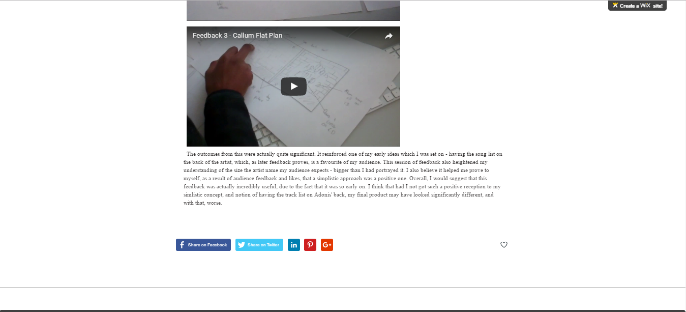
| Number 1 is the final product of my ancillary stuff (now uploaded) |
 |
| Gonna have to do an animatic then |
| Basically an evaluation |

Blogging health check 3
After an improvement to your blog during the music video research stage, you have disengaged with this aspect of the coursework and have dropped marks so that you are now attaining a mark below your target grade and into level 2 - which is disappointing. There are only 2 posts on your blog since the start of term and you are very behind with the ancillary tasks. You have until the 3rd Feb to rectify this Tristen, I hope you do as you made such a good start this year and I'd love to see you back into level 3 with this work.
to do:
1. CATCH UP - complete the following tasks: - 48,49,52,53,54,56,57,58,59,60
2. post up a clearer storyboard for your music video EVEN IF THIS MEANS YOU HAVE TO RE-DRAW IT.
3. post up an animatic


Monday, 23 January 2017
Question 2 - Drafting


This acted almost as a script for my vlog about synergy. I had planned that I wanted to record myself and use images (imported into Premiere Pro) to reinforce my points. The final sentence, for example, was directly scripted but the most of these two pages just worked as a guide for what I wanted to say. I had the information for real media products up as tabs on chrome so I could refer to them if needed.


Friday, 20 January 2017
Evaluation Question 3 DRAFTING
I separated my draft into 5 parts - Construction Editing, Construction Filming, Planning, Research and Evaluation . I decided I would do a small video for each discussing how I was doing it. I will use Camtasia for all of them except filming, where I will use a flipcam.


Ancillary drafts
For these drafts I am experimenting with different font ideas and colors.
I intend to use Archeologicaps as the font throughout the ancillary because it is an allusion or reference to the artist's name Adonis which links to Greek mythology. This also the reason why I chose the Album name chronicle. This will ensure that the artist's name, font and album name are all related and this should be clear to the audience
Wednesday, 18 January 2017
Tuesday, 17 January 2017
Saturday, 14 January 2017
Drafts part 2
I decided to change the background of the digipak as the brick background was too bare and seemed quite boring. Also an empty cathedral fits the theme of ancient and greek mythology that im am trying to create.
Friday, 13 January 2017
Draft 1 - Outside and Inside
 |
| These are my outside panels. I may yet change the size of the production information, and with that the size of font on the song list. I am also unsure about the lines between the songs, but am keeping that for now. I also need to do some audience research to find out if the font suits our genre. |
 |
| These are my inside panels. They look bare - but at the moment this is not a problem. I really want to have the gloves cut out better so the edges don't look as strange. Also, I'd like to add an outer ring on the CD but have no idea how to do this. There is also a possibility I may edit the colour of the CD to a grey rather than a white. |
Thursday, 12 January 2017

Wednesday, 11 January 2017
Tuesday, 10 January 2017
Photohop tutorial - draft
This is a quick draft of a digipak from the photo-shop tutorial. It is really poor but sufficient for the purpose of the tutorial. There are many things i can improve on as i get to know the software better.

Practising on Photoshop
Tuesday 10th January - Practising Photoshop


This morning we've been using photoshop for the first time (for me anyway) and have been using a template of both an artist and a background.
My front panel looked like this:

This looked ugly obviously but I was just testing my abilities in putting text, transforming an image, blending, and adding colour.
As I was progressing and getting towards completing a back panel, it crashed. However I did get a picture of my work at that point.

Obviously my final thing is gonna be better, but I feel competent (to an extent) with the basic skills I will need.
Ancillary Inner panels

For the inner panels of the digi-pak I decided to be unconventional and instead of using another picture of the artist on the same background, I decided to use another empty cathedral background i cam across and coupled the disk image with the logo of the 'publishing company'. I felt like this works because both images are circular and are slightly contrasting in terms of colour scheming.
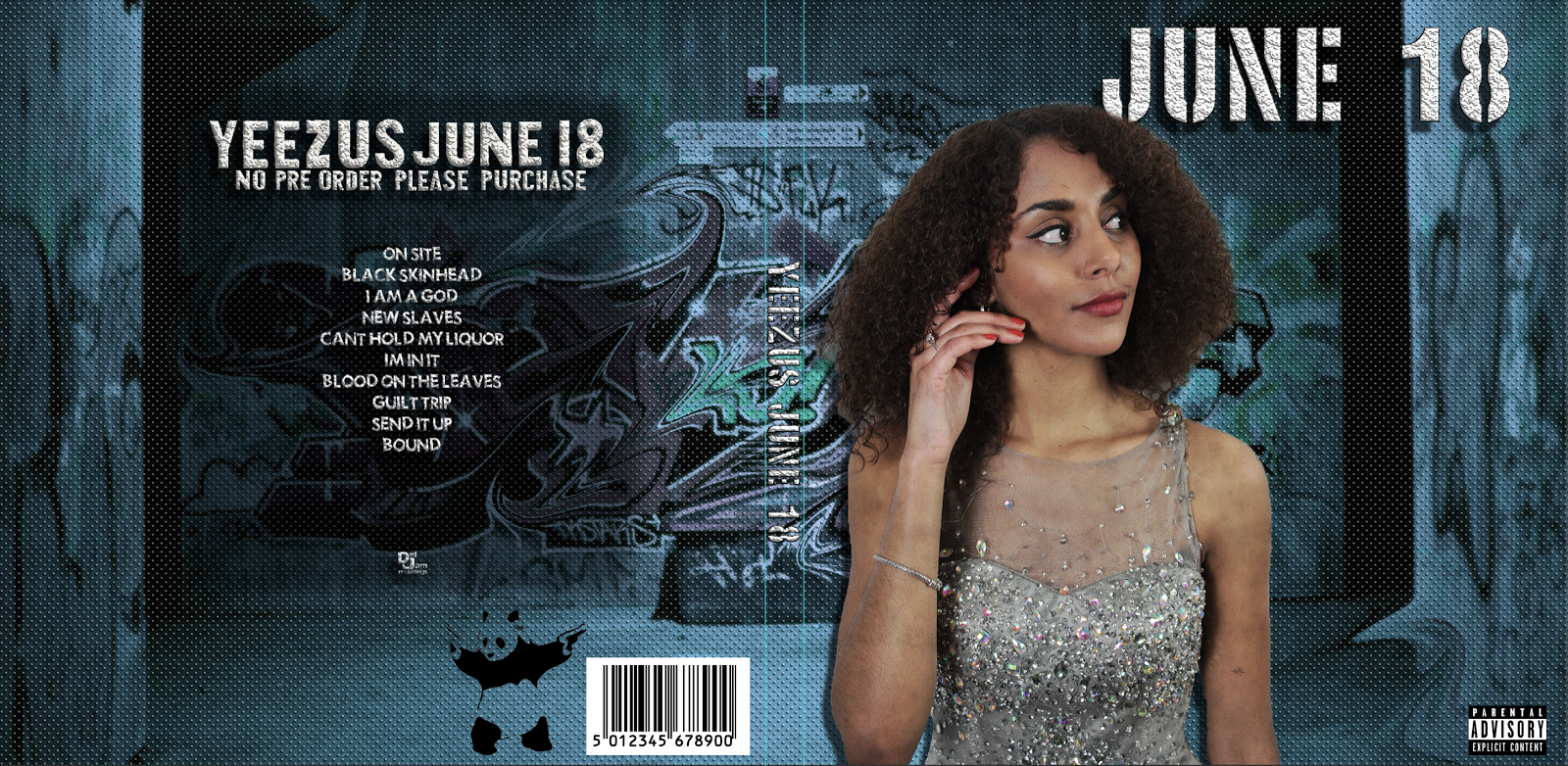
Outer Panels (DIGI PAK) - Final

The outer panels of the Digi-pak has been designed to focus on the artist himself. The gesture of him 'praying' is reflected by the empty cathedral in the background. I was reluctant to use a church because i felt that a cathedral reflected the Greek mythology aspect of the artist such as his name. I also attempted to do this using the font Archeologicaps.
The outer-panels include the codes and conventions of a typical digi pak. For example, the artist is the primary focus as the picture stands out aswell as the name of the artist is the largest font on the page. The tracklist is on the 'back' of the digipak. The album's name is positioned in the middle of the digipak along with the publishing company's logo below it. The copyright message is positioned at the bottom of the digipak on the back next to the logo and barcode.
Friday, 6 January 2017
Feedback on Font
This is obviously limited feedback but necessary - purely because I wanted a second opinion just to confirm what I already thought. I found this helpful just to consolidate my ideas so I felt more comfortable completing my mock-up.
Wednesday, 4 January 2017

Flat Plans - Magazine and Digipak
 |
| Front Panels |
 |
| Inside Panels |
 |
| Magazine Advert |
Tuesday, 3 January 2017
Monday, 2 January 2017
Digipak Mock Up
The slideshow above documents my progress in making this mock-up digipak. I used a program similar to photoshop - GIMP (free version). The descriptions describe a lot of my thought process, but I would like to clarify that ideally I would not be using these images. As mentioned in a previous post, I want to take new photos for our digipak and advertisement. The mock-ups are also available to see here:


Sunday, 1 January 2017
Rough Ideas
Alright so I've just been doing some thinking about what I can invisage as a magazine advert. Obviously I am not using any form of ICT but I felt it important I just get down some rough ideas.
Basically, as I've seen in the other magazine adverts (see annotations) they are very minimalistic and I like this. However, our image selection that we took while filming had the rec and the estate in the background - and it was horizontal as opposed to vertical. This would be too much in my opinion. My idea is to go out and take another set of pictures - still outside and against an urban background as this is, to an extent, part of our image across the products. If we used a grimey dark urban wall with Adonis resting on, for example, we could stick to our monochromatic colour scheme and use white text to make the image still eyecatching. This wouldn't need to be at a special location - literally just an urban area and possibly one from our music video (synergy again).
This is obviously my magazine advert idea, but as synergy is so important it would need to be transferred to the digipack as well - we could take a variety of pictures like this for the other panel OR use our original image on the back. Either way, I think there is no harm in going out and taking another set of photos for this purpose.
UPDATE:
QUICK DIGIPACK IDEA
As I am doing my mock-up, I thought of how the the digipack could look with these new images (which I now have decided I want but will continue to do mock up with what I have). On the first panel, it would be that image against the wall (Adonis in CENTRE of frame) with text above. On the back, I think it would be nice to have the text (song list etc) on Adonis' back as he walks away from the camera (still in urban area) possibly with estate in background.
Subscribe to:
Comments (Atom)